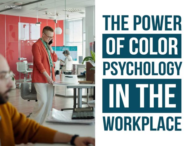
Imagine walking into a room painted in a warm yellow. The color immediately makes you feel cheerful and energized. Now, picture another room in a muted gray—it feels more subdued and calming, right? This is the essence of color psychology.
Colors have a profound impact on our emotions and behaviors. For office managers, understanding the power of color psychology in the workplace can be a game-changer in designing offices that boost productivity and enhance employee well-being.
Understanding Colors and Their Effects
Red – The Energizer
Red is synonymous with energy, passion, and action. In a workplace setting, red can serve as a powerful stimulant, invigorating the atmosphere and increasing heart rates. This can be particularly beneficial in collaborative spaces where dynamic energy can spur innovation and teamwork. Red accents in such areas can enhance participants’ adrenaline, boosting their engagement and contribution.
However, too much red can lead to agitation or stress. Balance is key; use red strategically in break rooms or areas designated for high-energy activities to harness its stimulating effects without overwhelming your team.

Blue – The Calmer
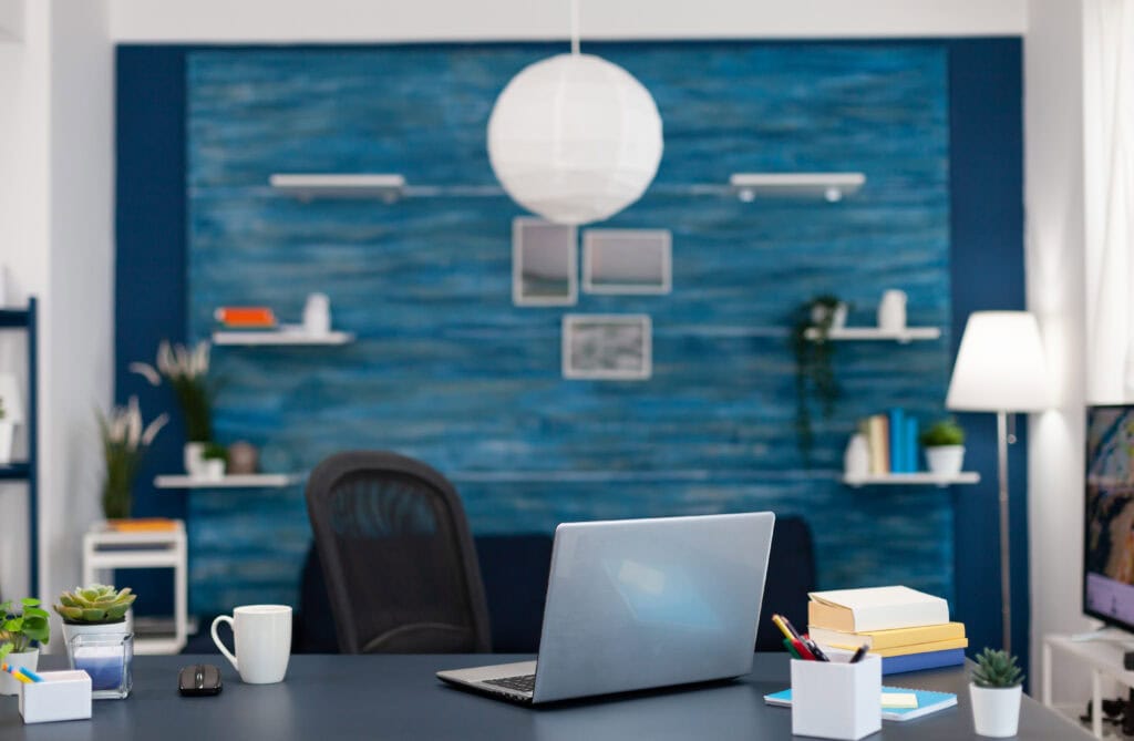
Blue is celebrated for its calming and soothing qualities. Often considered the most productive color, blue enhances concentration and mental clarity, making it ideal for environments where focus is paramount.
A meeting room adorned in a serene shade of blue can facilitate smooth discussions and clear decision-making. Individual workstations with blue accents can help employees maintain a calm and focused demeanor throughout the day. Incorporating blue into your workspace can transform it into a haven of productivity and tranquility.
Even though there are many benefits to having a blue workplace, too much blue can create a monotonous and uninspiring setting, potentially leading to feelings of isolation or sadness. In areas where creativity and warmth are needed, an abundance of blue might dampen enthusiasm. To counteract these issues, pair blue with warmer colors and materials, such as wooden furniture or bright accessories, to introduce balance and comfort.
Yellow – The Optimist
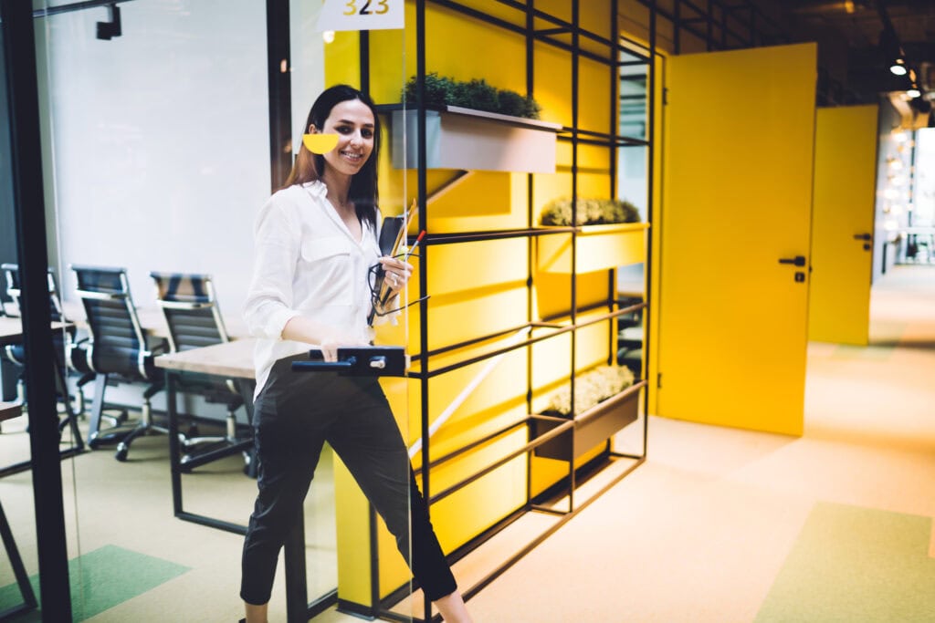
Yellow radiates happiness and optimism, acting as a beacon of positivity in the workplace. This sunny hue can stimulate creativity and encourage innovative thinking. A creative space with yellow accents can inspire employees to generate groundbreaking ideas.
However, it’s important to use yellow judiciously, as too much can overwhelm and induce anxiety. A splash of yellow in brainstorming areas or creative departments can invigorate the senses and foster a vibrant, innovative environment without overpowering the space.
Green – The Balancer
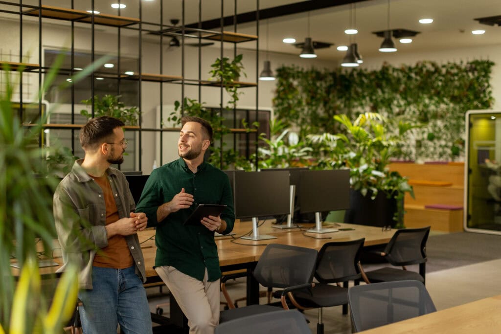
Green epitomizes balance and harmony, offering a soothing visual experience that reduces eye strain—perfect for workplaces where employees spend long hours. Green’s association with growth and renewal can be leveraged by incorporating it into general work areas or through office plants, bringing a touch of nature indoors.
Accents of green create a serene and balanced atmosphere, promoting well-being and sustained productivity. Green is not just a color; it’s a breath of fresh air that revitalizes the workplace.
Orange – The Motivator
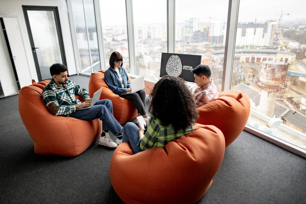
Orange merges the energetic essence of red with the joyful nature of yellow, creating an enthusiastic and lively ambiance. This vibrant color can boost motivation and enthusiasm, making it ideal for communal spaces like kitchen areas or lounges. Orange highlights in these areas can create a lively atmosphere where employees feel reinvigorated.
As with red, moderation is crucial—use orange sparingly to avoid overstimulation. Incorporating orange in the right doses can transform mundane spaces into hubs of energy and motivation.
Purple – The Innovator
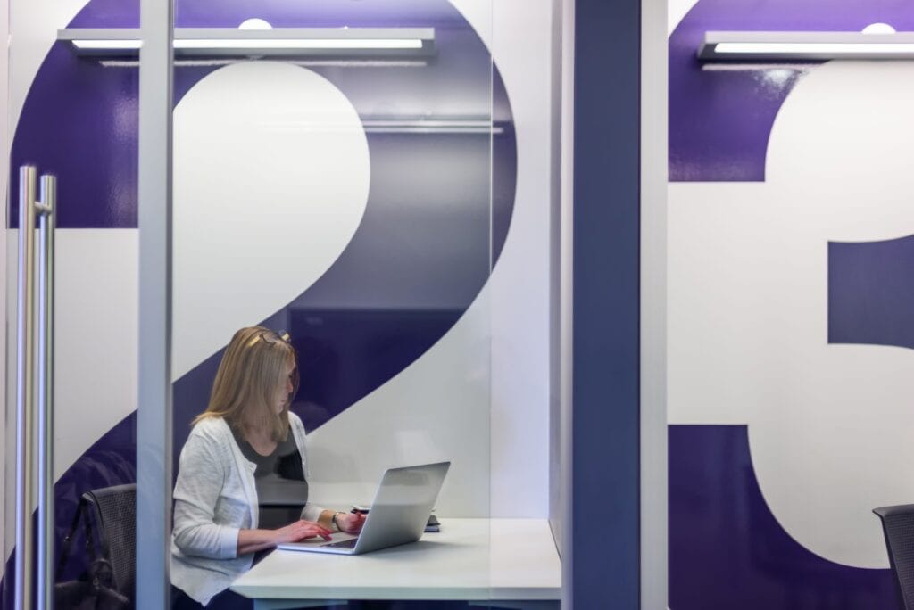
Purple carries connotations of luxury, creativity, and wisdom. This versatile color can inspire innovative thinking and a sense of calm, making it perfect for creative departments or quiet zones.
Light shades of purple, like lavender, can promote a tranquil atmosphere, providing a sanctuary for relaxation and rejuvenation. However, even though purple is linked to creativity and luxury, excessive use can become overpowering and create a sense of excess or artificiality. Too much purple can make a workplace feel overly dramatic or out of touch with practicality. In areas requiring clear thinking and efficiency, an overload of purple might be counterproductive. To balance this, use purple as an accent to inspire creativity without overshadowing functionality. Pair it with neutral tones to maintain harmony and professionalism.
Pink – The Soother
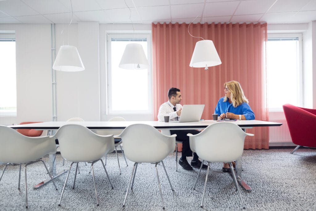
Pink is often associated with compassion, nurturing, and calm. It can create a soothing and comforting environment, making it ideal for wellness rooms or spaces dedicated to relaxation and stress relief.
Light pink tones can ease tension and promote a sense of tranquility, helping employees unwind and recharge. Incorporating pink in moderation can also foster a sense of positivity and emotional balance in the workplace.
However, be cautious. While pink is known for its soothing and nurturing qualities, overuse can make a space feel overly sentimental or juvenile. Excessive pink can undermine the professional atmosphere of a workplace, making it appear less serious or too casual. In areas that require focus and productivity, too much pink might become a distraction rather than a calming presence. To mitigate these effects, use pink as an accent rather than a dominant color, incorporating it in small doses in wellness or relaxation areas to maintain balance.
Brown – The Stabilizer
Brown signifies stability, reliability, and comfort. It can ground a space and create a warm, inviting atmosphere. This earthy color is perfect for communal areas such as break rooms or lounge spaces where employees seek a homely, comfortable environment. Brown tones can also be used in individual workstations to promote a sense of dependability and focus.
The use of brown can make the workplace feel more grounded and secure, enhancing overall well-being. However, brown’s association with stability and comfort can turn negative when overused, as it may make a space feel dull, heavy, or uninspiring. An environment dominated by brown can appear outdated or overly rustic, detracting from a modern, dynamic workplace vibe. In communal areas or individual workstations, too much brown can also reduce energy levels and dampen creativity. To counteract these potential pitfalls, balance brown with lighter, more vibrant colors and use it in combination with textures and materials that add visual interest and contrast.

Gray – The Neutral
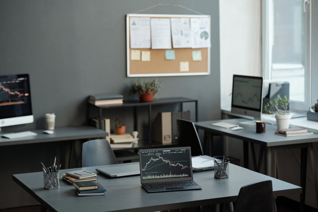
Gray is a versatile and neutral color that can balance out more vibrant hues in the workplace. It is associated with professionalism, sophistication, and practicality. Gray can help tone down brighter colors and create a harmonious and cohesive environment. It’s ideal for corporate settings and meeting rooms where a professional yet calm atmosphere is essential. Gray accents can also provide a modern and sleek aesthetic, fostering a sense of balance and neutrality.
Gray’s sophisticated and neutral quality can become a downside when it leads to a cold, sterile, or overly monochromatic environment. An excess of gray can dampen the mood, making the workplace feel lifeless and uninviting. This can negatively impact employee morale and engagement, leading to a lack of enthusiasm and dynamism. To prevent this, pair gray with warm accents, such as wooden elements or colorful accessories, to add warmth and personality to the space. Additionally, incorporating varying shades and textures can create depth and maintain the professional yet welcoming atmosphere.
Real-World Examples of Companies Using Color in Their Workplaces
Google’s offices are renowned for their vibrant and playful use of colors, reflecting the company’s innovative and dynamic brand identity. The spaces are often adorned with bright primary colors such as red, blue, yellow, and green. These colors are not just aesthetically pleasing but also strategically chosen to foster a creative and energetic work environment. The bright hues stimulate the mind, encouraging employees to think outside the box and stay inspired. Additionally, the playful ambiance helps reduce stress and promotes a positive atmosphere, making the workplace enjoyable and motivating.
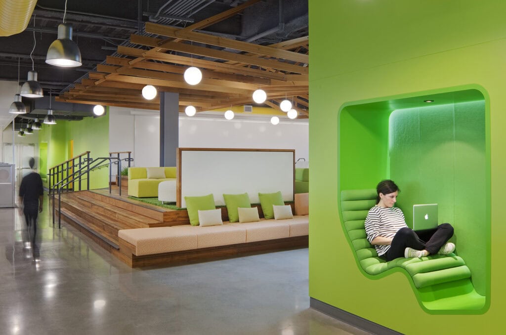
Facebook primarily uses blue in its office spaces, a color that aligns perfectly with its brand identity. Blue is associated with trust, calmness, and focus, helping to create a serene and productive work environment. The consistent use of blue fosters a sense of reliability and stability, which is crucial for a social media giant that deals with vast amounts of personal data. This calming color scheme helps employees maintain concentration and reduces anxiety, contributing to a more focused and efficient workspace. The subtle integration of other neutral tones ensures that the environment remains balanced and not overly monotonous.
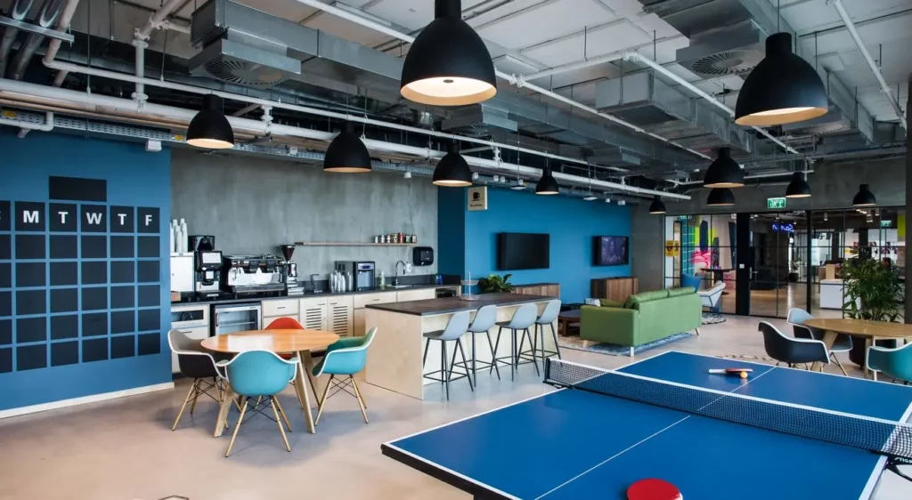
Airbnb
Airbnb’s offices are designed with warm and inviting colors, including soft pinks, earthy tones, and subtle greens. These colors create a homely and welcoming atmosphere, mirroring Airbnb’s brand focus on hospitality and community. The warm palette makes the workspace feel comfortable and inclusive, encouraging collaboration and communication among employees. This color scheme helps in reducing workplace stress and enhances employee well-being by creating a sense of belonging and warmth. The strategic use of these colors ensures that the workspace remains both inspiring and relaxing.
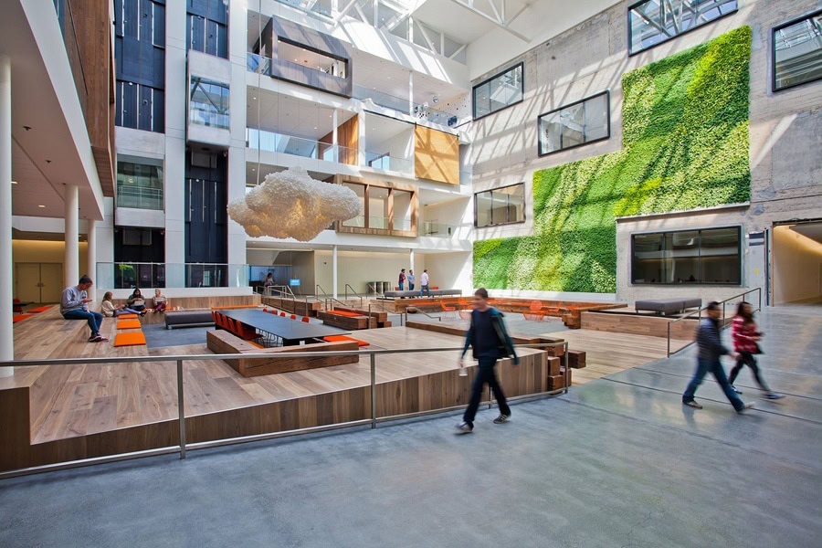
Dropbox
Dropbox employs a mix of neutral and bold colors in its office decor. The use of gray, combined with pops of vibrant colors like orange and green, strikes a balance between professionalism and creativity. Gray provides a solid, neutral backdrop that conveys stability and focus, while the bright accents inject energy and innovation into the space. This combination supports a dynamic work environment where employees feel both grounded and inspired to innovate. The thoughtful use of these contrasting colors helps in maintaining a balanced atmosphere that is conducive to both individual concentration and collaborative creativity.
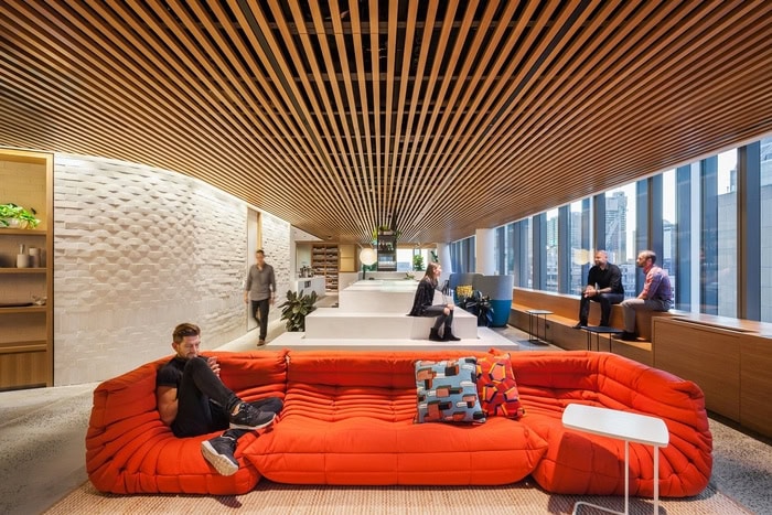
LEGO
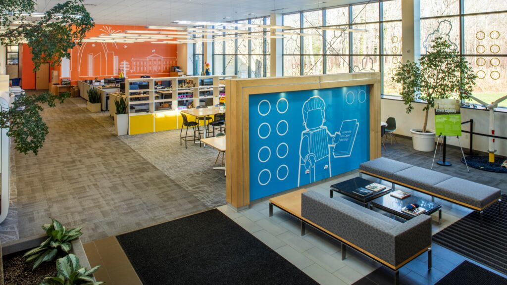
LEGO’s offices are a testament to the company’s playful and imaginative spirit. Filled with bright and cheerful colors such as red, yellow, green, and blue, the workspace is designed to stimulate creativity and fun. These vibrant colors are reflective of LEGO’s brand identity, which revolves around play and innovation. The lively environment encourages employees to think creatively and come up with innovative solutions, fostering a culture of inspiration and engagement. The playful color scheme not only boosts morale but also makes the workplace an exciting and enjoyable space, which is integral to LEGO’s overall company ethos.
These examples demonstrate how thoughtful use of color can significantly enhance the workplace environment, aligning with the company’s brand identity and supporting employee well-being and productivity. By leveraging the psychological impacts of color, these companies create spaces that are not only visually appealing but also highly functional and conducive to achieving their corporate goals.
The Importance of Color in Office Design
Incorporating color psychology into office design can lead to significant improvements in employee productivity, creativity, and well-being. Thoughtfully chosen colors can transform a mundane workspace into an inspiring and efficient environment. As an office manager, you have the power to create a space that not only looks good but also feels good to work in.
Now that you understand the impact of colors in office design, it’s time to discover how the colors of your tie can make a statement!

